
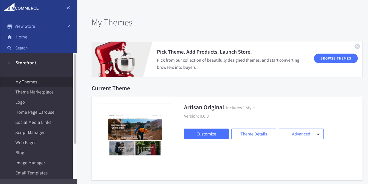
Artisan comes with a variety of settings which allow you to customize your store without modifying any code. To access these settings navigate to Storefront > My Themes and click on the "Customize" button associated with the theme currently applied to your store.
Here we will walk through the key settings available in each section and how they effect your store.
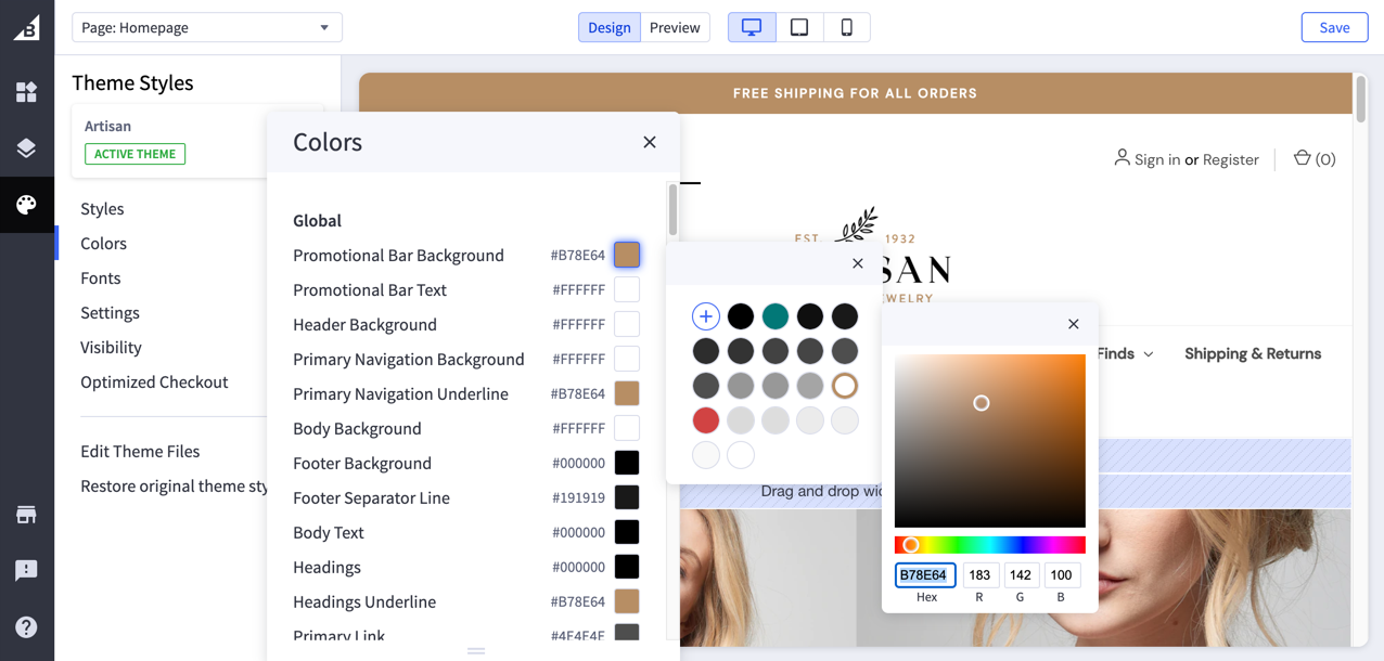
Colors
In the colors section there are a variety of options allowing you to tailor the theme colors to your branding. You have the ability to set these with either a HEX or RGB value, or use the color picker to chose a new color.
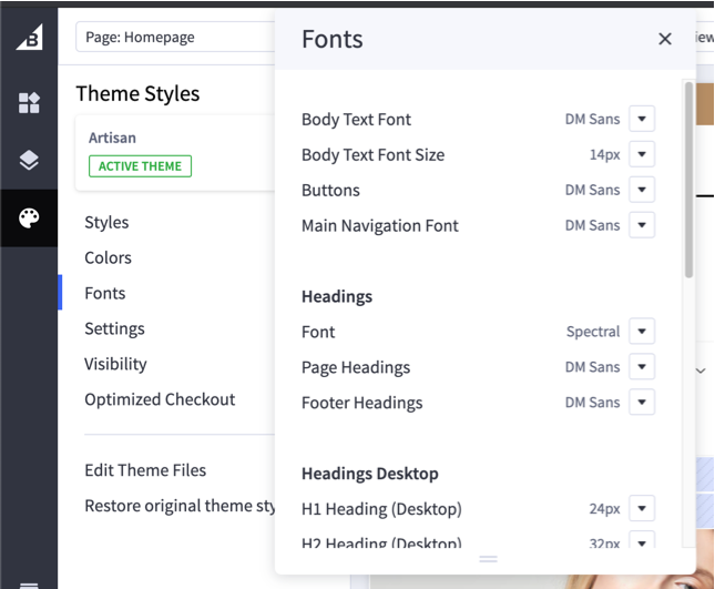
Fonts
In the fonts section you have control over the font families used throughout the site. You can control the body, headings, text logo, and product card title fonts separately. This section also has options to set font sizes for various elements.
Settings
Global
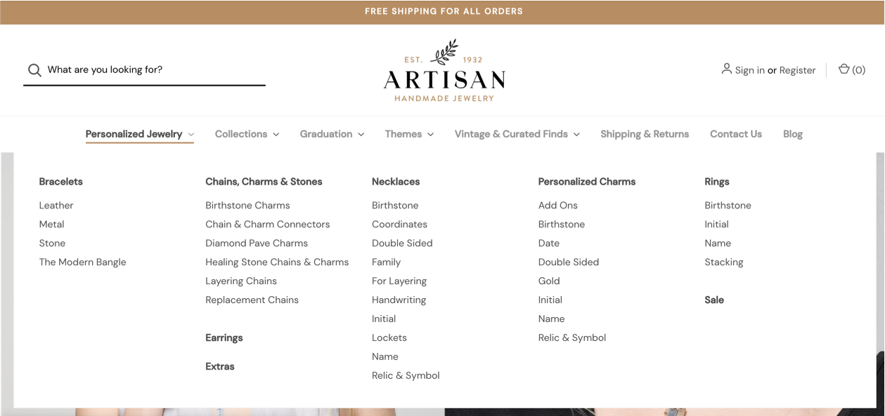
Number of links per column in drop downs allows you to select how many sub links are shown in each column of the navigation drop downs. The theme is setup to do a smart calculation based on this number to ensure that third level links don't get split into multiple columns. This also means if a column doesn't have enough space to fit the next group of second and third tier links it will start a new column.
Below is an example where the number of links per column is set to 10.
Desktop sticky navigation, when this option is checked, the navigation bar becomes sticky as you scroll down the page on desktop screen sizes.
Require Customer Login to Purchase, when this option is checked, makes it impossible for visitors to purchase from your store without having an account and being logged in.
Product Grid
Product Card Image Ratio allows you to set the size ratio of your product card images. Depending on the height to width ratio of your product images you can customize exactly the Product Card Image Ratio to optimize the display of your product cards. 1:1 is the default which is a square image with the same height to width ratio. There are a variety of settings all the way from 16:9 which is wide and short, to 9:16 which is tall and narrow. This same option exists for Subcategory Image Ratio as well which allows you to optimize your subcategory image display.
This section also contains settings which allow you to specify how many products you would like to show per row on desktop, tablet, and mobile.
Image Sizes (Misc.)
There are three options for setting the size of your store logo: Original (as uploaded), Optimized for theme, and Specify dimensions.
Original (as uploaded) will display your logo as you upload it without resizing.
Optimized for theme will resize your logo the the theme default which is ideal for the layout. The Artisan default is 175px wide by 90px tall.
Specify dimensions allows you to put in the exact dimensions you want the logo to display as.
Both the Optimized for theme, and Specify dimensions options allow you to upload a larger logo and set its display dimensions to be smaller. This makes the logo optimized for retina screens which means it's visually crisper on those devices.
These same options are also available for you to specify your optimal logo size on mobile which kicks in on devices 800px wide or smaller.
The Optimized for theme and Specify dimensions options also exist for the following areas: Blog Post Image, Brand Thumbnail, Swatch on Product Page, Image Sizes (Products), Product Page Main Image, Product Page Additional Image Thumbnails, Product Page Zoom Image, In Cart Product Image Thumbnail.
# of Products Per Page
In this section you can customize how many products display per page on the Category, Brand, Search Results, and Blog Summary pages.
Product Page
The Use Product Warranty for Short Description setting allows you to re-purpose the warranty field for a short description. When this setting is checked, the content added to the warranty field will appear above the product options on the product page.
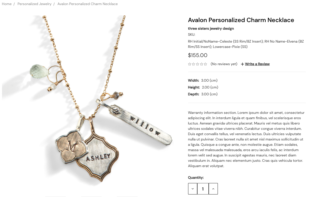
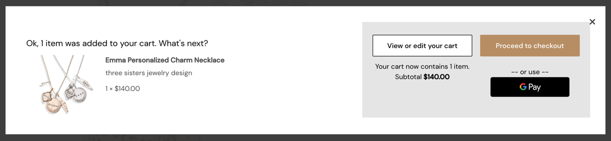
Show Added to Cart Pop Up controls what happens after adding a product to your cart from the product page. If this option is checked, a pop up window will appear showing you the product that was just added, your current cart total, and some related products. If unchecked you will be taken directly to the cart page after adding a product to your cart.
Show Related Products in Tabs, when checked, the related products will appear in a tab on the product page. If unchecked, the related products will appear below the product tabs and will always be visible on the product page. This same functionality applies to the Show Customers Also Viewed Products in Tabs option.
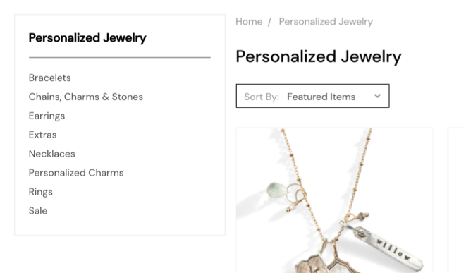
Category Page
Capitalization of product and category names lets you decide if you would like all of your product and category names to be capitalized or if you would like them to display as you have entered them in BigCommerce.
Shopping Cart & Checkout
If you have an SSL with GeoTrust you can use the GeoTrust SSL Common Name to enter your SSL name and have the trust logo automatically appear in your store footer without having to add any custom code. You also have the option to select what size you want the GeoTrust seal to appear with the GeoTrust Seal Size option.
Visibility
The visibility section is where you'll find settings for showing and hiding elements.
Header
Show Site Wide Promotional Bar allows you to show a text banner at the top of all of your pages. The text to be shown can be edited in the Promotional Bar Text input box.
Show Web Pages in Primary Navigation lets you to choose if you would like the content pages to be shown in the main navigation.
Footer
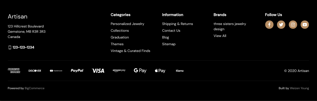
Show Brands lets you choose if you want to show a list of the brand links in the footer.
Show Social Media Icons lets you decide if you want your social media links to display in the footer.
You can control which payment provider logos you would like to show in the footer (if any). You are able to choose from American Express, Discover, Mastercard, Paypal, Visa, Amazon Pay, Google Pay, Apple Pay, and Klarna.
There is also an option for the display of your store copyright information Show "©", Current Year and Store Name.
Home Page
If you have images uploaded into your carousel builder that you don't want to lose but you don't want the carousel to show on your home page you can uncheck the Show Carousel setting.
You can control the number of featured products, popular products, new products, and recent blog posts which display on the home page with the # of Featured Products, # of Most Popular Products, # of New Products, # of Recent Posts settings.
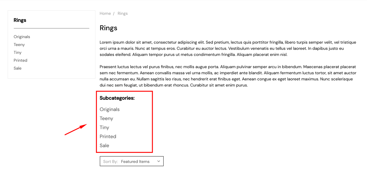
Category Page
Show Subcategories controls the visibility of the subcategories in the main content area of the category page.
Product Page
You can control the # of Related Products, the # of Customers Also Viewed Products, and the # of Product Reviews which get shown. In the case of the product reviews you are selecting how many are shown per page.
You also have control over whether or not you would like to Show Product Weight, or Show Product Dimensions.
Product Cards
Product cards refer to the product boxes which display on the category pages, home product sections, and anywhere you see lists of products in that fashion on the site. These settings apply to all of the product cards throughout the site.
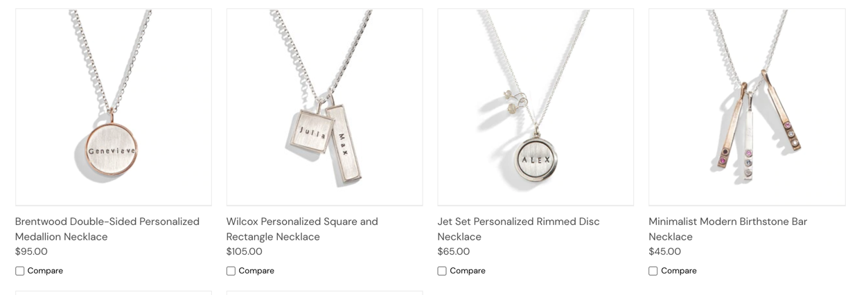
Show Alternate Image on Hover makes it so that the second image associated with the product is shown when you hover over the card. If the second image is set as the default image to show for that product then the first image will be shown on hover instead. For products which only have one image nothing will change on hover.
The quick view feature allows you to see a popup window with the details of that particular product without navigating away from the current page. You can easily toggle this feature on or off with the Show Quick view Button setting.
If you list products which vary in price depending on which options are selected, turning on the Price Ranges setting will show the price range right on the product card.
Artisan is setup to show two different badges on the product card, the sale badge, and the low stock badge. The visibility of these can be controlled separately with the Show Sale Badge, and Show Low Stock Badge, options. The sale badge shows in the upper left hand corner and the stock badge shows in the upper right corner. The color of the background and text of these badges can be customized in the Colors section of the theme editor.
Show Brand lets you choose to display the brand in the product card or not.
Left Column (Category / Search Results)
These settings control the display of elements in the left column on the category and search results pages.
The Show "Shop by Price" option will show a panel which allows visitors to filter products based on a price range they define.
Show Sub-Categories allows you to show the subcategories for the category you're currently on inside the left column.
Optimized Checkout
This section has a variety of options for customizing the look of your optimized checkout experience.